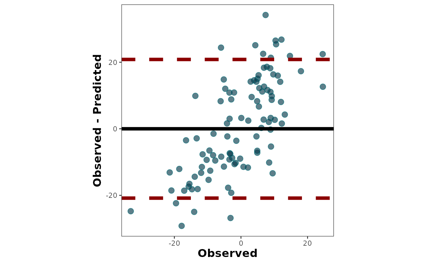
It creates a scatter plot of the difference between observed and predicted values (obs-pred) vs. observed values.
Usage
bland_altman_plot(
  data = NULL,
  obs,
  pred,
  shape_type = NULL,
  shape_size = NULL,
  shape_color = NULL,
  shape_fill = NULL,
  zeroline_type = NULL,
  zeroline_size = NULL,
  zeroline_color = NULL,
  limitsline_type = NULL,
  limitsline_size = NULL,
  limitsline_color = NULL,
  na.rm = TRUE
)
Arguments
- data
(Optional) argument to call an existing data frame containing the data.
- obs
Vector with observed values (numeric).
- pred
Vector with predicted values (numeric).
- shape_type
number indicating the shape type for the data points.
- shape_size
number indicating the shape size for the data points.
- shape_color
string indicating the shape color for the data points.
- shape_fill
string indicating the shape fill for the data points.
- zeroline_type
string or integer indicating the zero line-type.
- zeroline_size
number indicating the zero line size.
- zeroline_color
string indicating the zero line color.
- limitsline_type
string or integer indicating the limits (+/- 1.96*SD) line-type.
- limitsline_size
number indicating the limits (+/- 1.96*SD) line size.
- limitsline_color
string indicating the limits (+/- 1.96*SD) line color.
- na.rm
Logic argument to remove rows with missing values
Details
For more details, see online-documentation
References
Bland & Altman (1986). Statistical methods for assessing agreement between two methods of clinical measurement The Lancet 327(8476), 307-310 doi:10.1016/S0140-6736(86)90837-8