Regression case: Assessing model agreement in wheat grain nitrogen content prediction
Leo Bastos & Adrian Correndo
2024-06-30
Source:vignettes/regression_case.Rmd
regression_case.Rmd1. Introduction

The metrica package was developed to
visualize and compute the level of agreement between observed
ground-truth values and model-derived (e.g., mechanistic or empirical)
predictions.
This package is intended to fit into the following workflow:
- a data set containing the observed values is used to train a
model
- the trained model is used to generate predictions
- a data frame containing at least the observed and
model-predicted values is created
-
metricapackage is used to compute goodness of fit and error metrics based on observed and predicted values
-
metricapackage is used to visualize model fit and selected fit metrics
This vignette introduces the functionality of the
metrica package applied to observed and
model-predicted values of wheat grain nitrogen (N) content (in grams of
N \(m^{-2}\)).
2. Wheat grain N content
Let’s begin by loading the packages needed.
Now we load the wheat data set included in the
metrica package.
# Load
data(wheat)

# Printing first observations
head(wheat)
#>        pred    obs
#> 1  2.577314  2.544
#> 2  3.989590  4.831
#> 3  5.645253  6.121
#> 4 13.125101 10.960
#> 5  4.955917  5.767
#> 6  6.687800  8.222
This data set contains two columns:
-
pred: model-predicted wheat grain N content, in g N
\(m^{-2}\),
- obs: ground-truth observed wheat grain N content, in g N \(m^{-2}\)
3. Visual assessment of agreement
3.1 Scatterplot of pred vs. obs
The simplest way to visually assess agreement between observed and predicted values is with a scatterplot.
We can use the function scatter_plot() from the
metrica package to create a scatterplot.
The function requires specifying at least:
- the data frame object name (
dataargument) - the name of the column containing observed values (
obsargument)
- the name of the column containing predicted values
(
predargument)
Besides a scatterplot, this function also adds to the plot the 1:1 line (solid line) and the linear regression line (dashed line).
scatter_plot(data = wheat,
             obs = obs,
             pred = pred)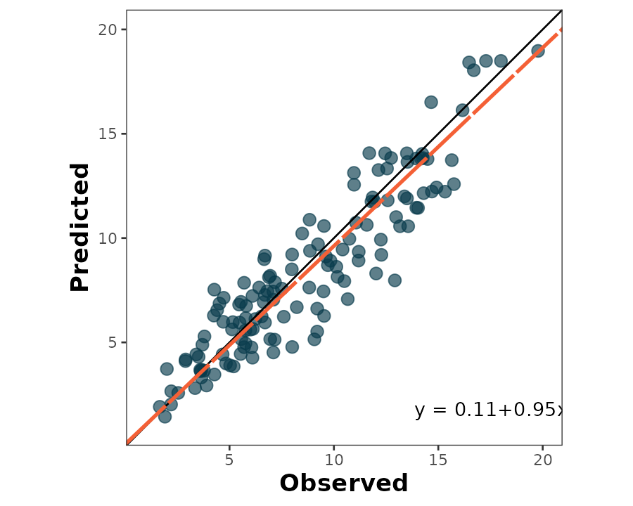
The default behavior of scatter_plot() places the
obs column on the x axis and the pred column
on the y axis (orientation = "PO"). This can be inverted by
changing the argument orientation to “OP”:
scatter_plot(data = wheat,
             obs = obs,
             pred = pred,
             orientation = "OP")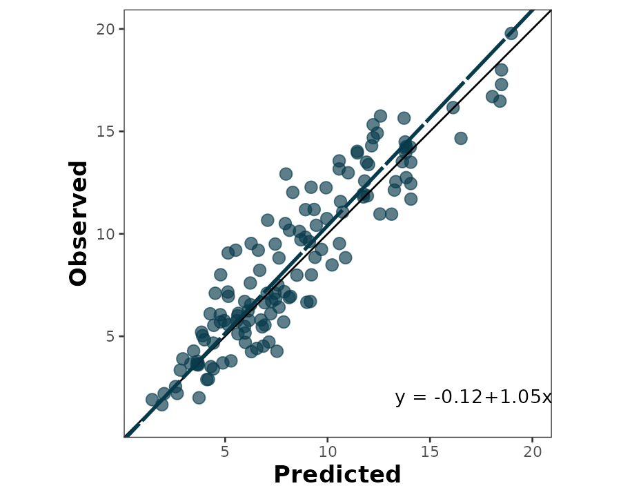
The output of the scatter_plot() function is a
ggplot2 object that can be further customized:
scatter_plot(data = wheat,
             obs = obs,
             pred = pred,
             orientation = "OP",
             regline_color = "#d0f4de",
             shape_color = "#80ed99",
             eq_color = "white",
             )+
  labs(x ="Predicted wheat N content (g N/m2)",
       y = "Observed wheat N content (g N/m2)")+
  theme_dark()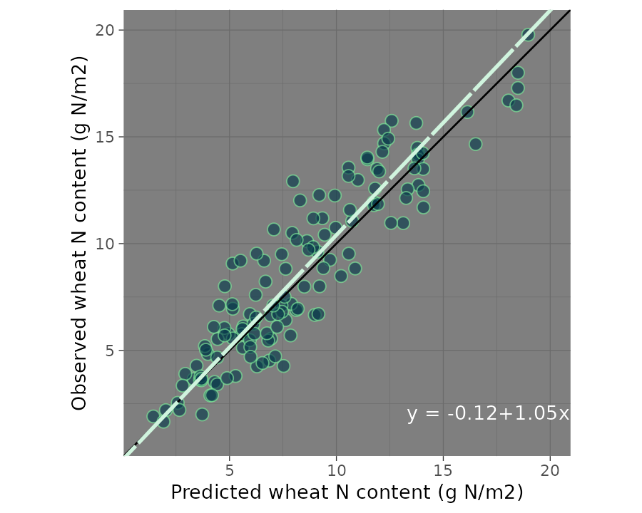
3.2 Bland-Altman plot
The Bland-Altman plot is another way of visually assessing observed vs. predicted agreement. It plots the difference between observed and predicted values on the y axis, and the observed values on the x axis:
bland_altman_plot(data = wheat,
                  obs = obs,
                  pred = pred)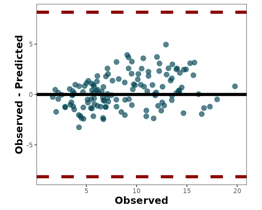
4. Numerical assessment of agreement
The metrica package contains functions for 41 metrics to assess agreement between observed and predicted values for continuous data (i.e., regression error).
A list with all the the metrics including their name, definition, details, formula, and function name, please check [here].
All of the metric functions take the same three arguments as the plotting functions:
- the data frame object name (
dataargument) - the name of the column containing observed values (
obsargument)
- the name of the column containing predicted values
(
predargument)
The user can choose to calculate a single metric, or to calculate all metrics at once.
To calculate a single metric, the metric function can be
called.
For example, to calculate \(R^{2}\), we
can use the R2() function:
R2(data = wheat,
   obs = obs,
   pred = pred, tidy = TRUE)
#>          R2
#> 1 0.8455538
Similarly, to calculate root mean squared error, we can use the
RMSE() function:
RMSE(data = wheat,
     obs = obs,
     pred = pred)
#> $RMSE
#> [1] 1.666441
The user can also calculate all 41 metrics at once using the function
metrics_summary():
metrics_summary(data = wheat,
                obs = obs,
                pred = pred,
                type = "regression")
#>    Metric       Score
#> 1      B0  0.11315564
#> 2      B1  0.95057797
#> 3       r  0.91953997
#> 4      R2  0.84555376
#> 5      Xa  0.99564191
#> 6     CCC  0.91553253
#> 7     MAE  1.32781184
#> 8    RMAE  0.15214665
#> 9    MAPE 17.51424366
#> 10  SMAPE 17.43518492
#> 11    RAE  0.37156585
#> 12    RSE  0.16128874
#> 13    MBE  0.31815953
#> 14    PBE  3.64561486
#> 15    PAB  3.64510277
#> 16    PPB  1.51438787
#> 17    MSE  2.77702701
#> 18   RMSE  1.66644142
#> 19  RRMSE  0.19094834
#> 20    RSR  0.09678632
#> 21 iqRMSE  0.25237725
#> 22    MLA  0.14328045
#> 23    MLP  2.63374656
#> 24   RMLA  0.14328045
#> 25   RMLP  2.63374656
#> 26     SB  0.10122549
#> 27   SDSD  0.04205496
#> 28    LCS  2.63374656
#> 29    PLA  5.15949064
#> 30    PLP 94.84050936
#> 31     Ue 94.84050936
#> 32     Uc  1.51438787
#> 33     Ub  3.64510277
#> 34    NSE  0.83871126
#> 35     E1  0.62843415
#> 36   Erel  0.77057561
#> 37    KGE  0.91064709
#> 38      d  0.95632264
#> 39     d1  0.80649196
#> 40    d1r  0.81421707
#> 41    RAC  0.95770115
#> 42     AC  0.84174217
#> 43 lambda  0.91553253
#> 44  dcorr  0.89747940
#> 45    MIC  0.78940412
If the user wants just specific metrics, within the same function
metrics_summary(), user can pass a list of desired metrics
using the argument “metrics_list” as follows:
my.metrics <- c("R2","MBE", "RMSE", "RSR", "NSE", "KGE", "CCC")

metrics_summary(data = wheat,
                obs = obs,
                pred = pred,
                type = "regression",
                metrics_list = my.metrics)
#>   Metric      Score
#> 1     R2 0.84555376
#> 2    CCC 0.91553253
#> 3    MBE 0.31815953
#> 4   RMSE 1.66644142
#> 5    RSR 0.09678632
#> 6    NSE 0.83871126
#> 7    KGE 0.91064709
5. Time series
5.1. Example of timeseries prediction
In some cases, we may count with time-series predictions
(e.g. cumulative values from daily simulations). For example, let’s say
that we evaluate the production of drymass during the season. For this
specific case, the Mean Absolute Scaled Error is a more solid metric
compared to conventional RMSE or similar metrics.
Let’s suppose that we have predictions of wheat grain N over the
years on the same location for a series of 20 years from 2001 to 2020.
Thus, we may get a random sample from the wheat data set and assume they
represent the time series of interest. Therefore, we create a new
time variable called Year that will serve to
sort the observations.
set.seed(165)

wheat_time <- metrica::wheat %>% sample_n(., size = 20) %>%
  mutate(Year = seq(2001,2020, by =1))

# Plot
wheat_time %>% ggplot2::ggplot(aes(x = Year))+
  geom_point(aes(y = pred, fill = "Predicted", shape = "Predicted"))+
  geom_point(aes(y = obs, fill = "Observed", shape = "Observed"))+
  geom_line(aes(y = pred, col = "Predicted", linetype = "Predicted"), size = .75)+
  geom_line(aes(y = obs, col = "Observed", linetype = "Observed"), size = .75)+
  scale_fill_manual(name = "", values = c("dark red","steelblue"))+
  scale_shape_manual(name = "", values = c(21,24))+
  scale_color_manual(name = "", values = c("dark red","steelblue"))+
  scale_linetype_manual(name = "", values = c(1,2))+
  labs(x = "Year", y = "Wheat Grain N (g/m2)")+
  theme_bw()+
  theme(legend.position = "top")
#> Warning: Using `size` aesthetic for lines was deprecated in ggplot2 3.4.0.
#> ℹ Please use `linewidth` instead.
#> This warning is displayed once every 8 hours.
#> Call `lifecycle::last_lifecycle_warnings()` to see where this warning was
#> generated.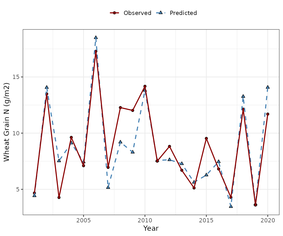
5.2. Use MASE for timeseries
In the case of timeseries analysis, the Mean Absolute Scaled Error
(MASE, Hyndman & Koehler, 2006), a scaled error metric, is
preferable over other classic metrics such as the RMSE. With
metrica, we can use the function MASE. Please, be aware
that MASE requires the obs and pred data along
with a third column corresponding to the temporal variable that sorts
the data (use the time argument to specify it). The default
method to scale the MASE is the naive forecast
(random-walk), which requires the user to define the size of the
naive_step. Otherwise, an out-of-bag MAE can be specified
with the oob_mae argument.
# MASE estimate, with naive approach (random-walk, i.e. using observation of t-1 as prediction)
metrica::MASE(data = wheat_time, obs = obs, pred = pred,
              naive_step = 1, tidy = FALSE, time = "Year")
#> $MASE
#> [1] 0.2444194
metrica::MASE(data = wheat_time, obs = obs, pred = pred,
              naive_step = 1, tidy = FALSE)
#> $MASE
#> [1] 0.2444194
# MASE estimate, with mae coming from an independent training set.
metrica::MASE(data = wheat_time, obs = obs, pred = pred,
              naive_step = 1, tidy = FALSE, time = "Year", oob_mae = 6)
#> $MASE
#> [1] 0.2143599
6. Visual and numerical assessment combined
The user can also create a scatter plot that includes not only the predicted vs. observed points, 1:1 line, and regression line, but also selected metrics and their values plus the SMA regression equation.
This is accomplished with the function
scatter_plot():
scatter_plot(data = wheat,
             obs = obs,
             pred = pred)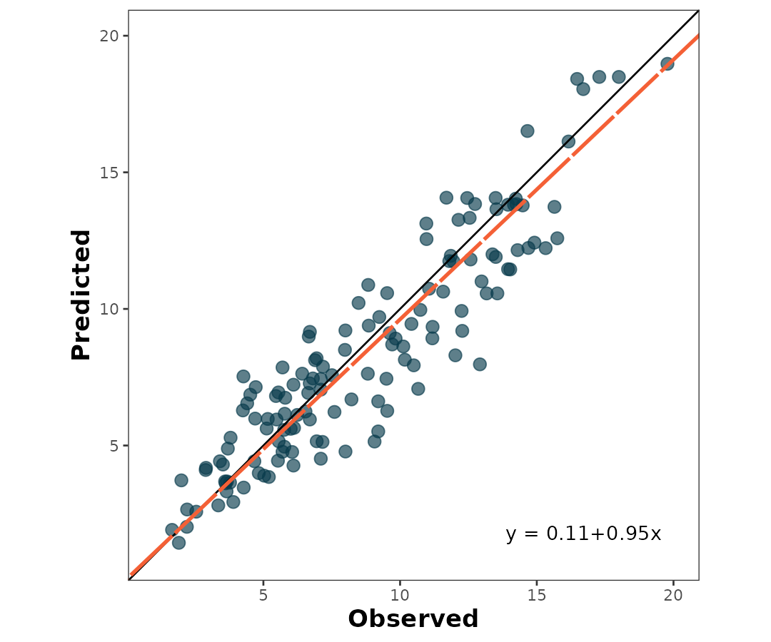
To print the metrics on the scatter_plot(), just use
print.metrics. Warning: do not forget to specify your
‘metrics.list’:
my.metrica.plot <- scatter_plot(data = wheat,
obs = obs,
pred = pred,
print_metrics = TRUE, metrics_list = my.metrics)
my.metrica.plot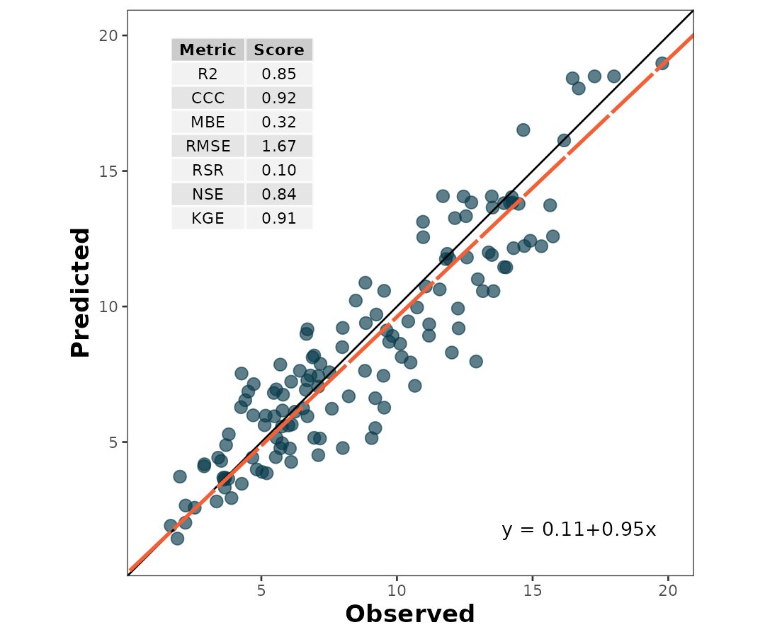 Also, as a ggplot element, outputs are flexible of further edition:
my.metrica.plot +
  # Modify labels
  labs(x = "Observed (days to emergence)", y = "Predicted (days to emergence)")+
  # Modify theme
  theme_light()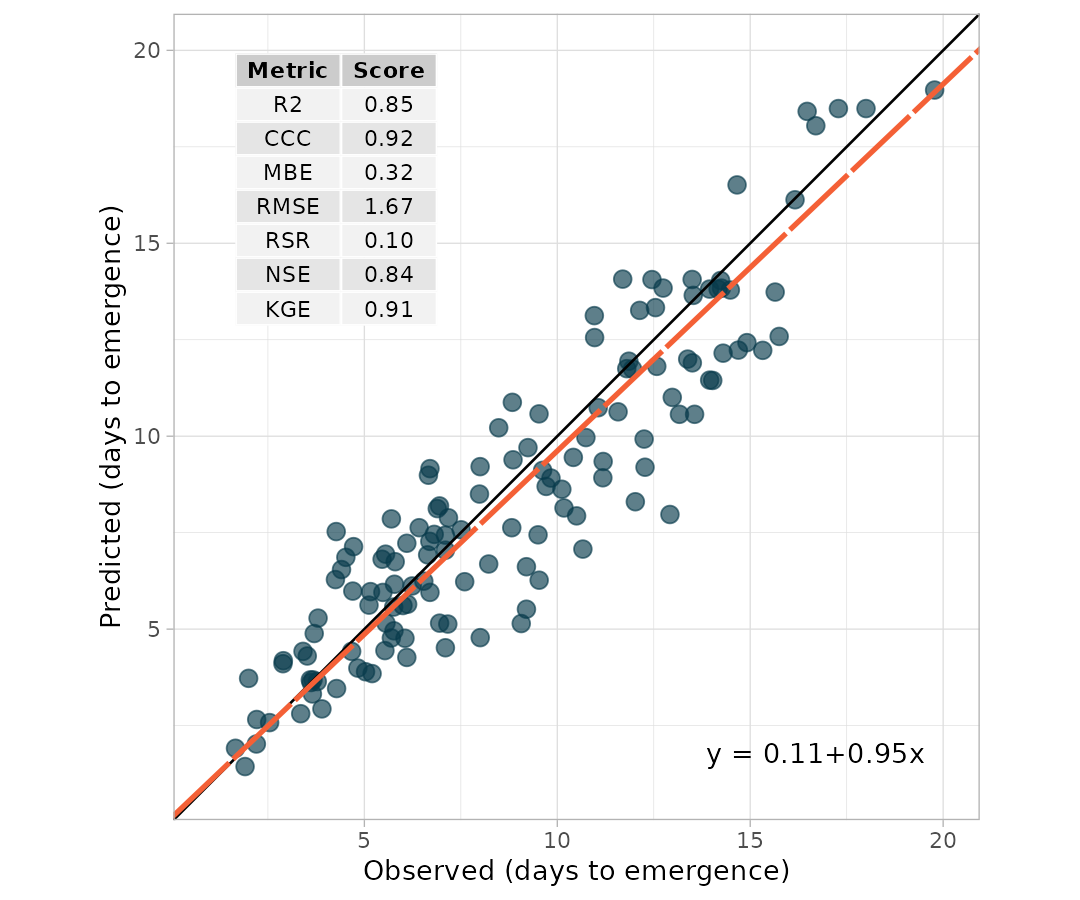
my.metrica.plot +
  # Modify labels
  labs(x = "Observed (Mg/ha)", y = "Predicted (Mg/ha)")+
  # Modify theme
  theme_dark()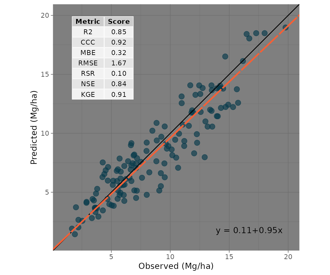
7. Exporting
To export the metrics summary table, the user can simply write it to
file with the function write.csv():
metrics_summary(data = wheat,
                obs = obs,
                pred = pred,
                type = "regression") %>%
  write.csv("metrics_summary.csv")
Similarly, to export a plot, the user can simply write it to file
with the function ggsave():
ggsave(plot = my.metrica.plot,
       "scatter_metrics.png",
       width = 5,
       height = 5)